


a Product Designer, I’ve been able to collaborate and partner with many product teams. Typically, my support role is focused on ensuring that mockups are cleaned up and pixel-perfect before being given to product engineering. And as an added level of quality, I also assess any UI that can be swapped in for components that already exist in the Design System. Over the years, I’ve internalized a quality checklist that I employ in these situations to help ensure mockups are build-ready. This allows me to think about the best way to handoff mockups from design to engineering. This blog post discusses how I provide pixel-perfect mockups to engineering partners that focus on presenting the necessary information, creating a seamless handoff experience.
Creating redlines for engineers
Pixel-perfection is something I care about a lot, especially when creating redlines. I fuss over the details; the curse (and superpower) of a production-minded designer. But this behavior elevates engineering-ready mockups because redlines become more than just a design spec. They transform into a communication resource between design and engineering, and through them, I want to ensure that everything the design needs to say is captured without question.
Redlines are the final deliverable and signal to engineering partners that they can commence the build process.
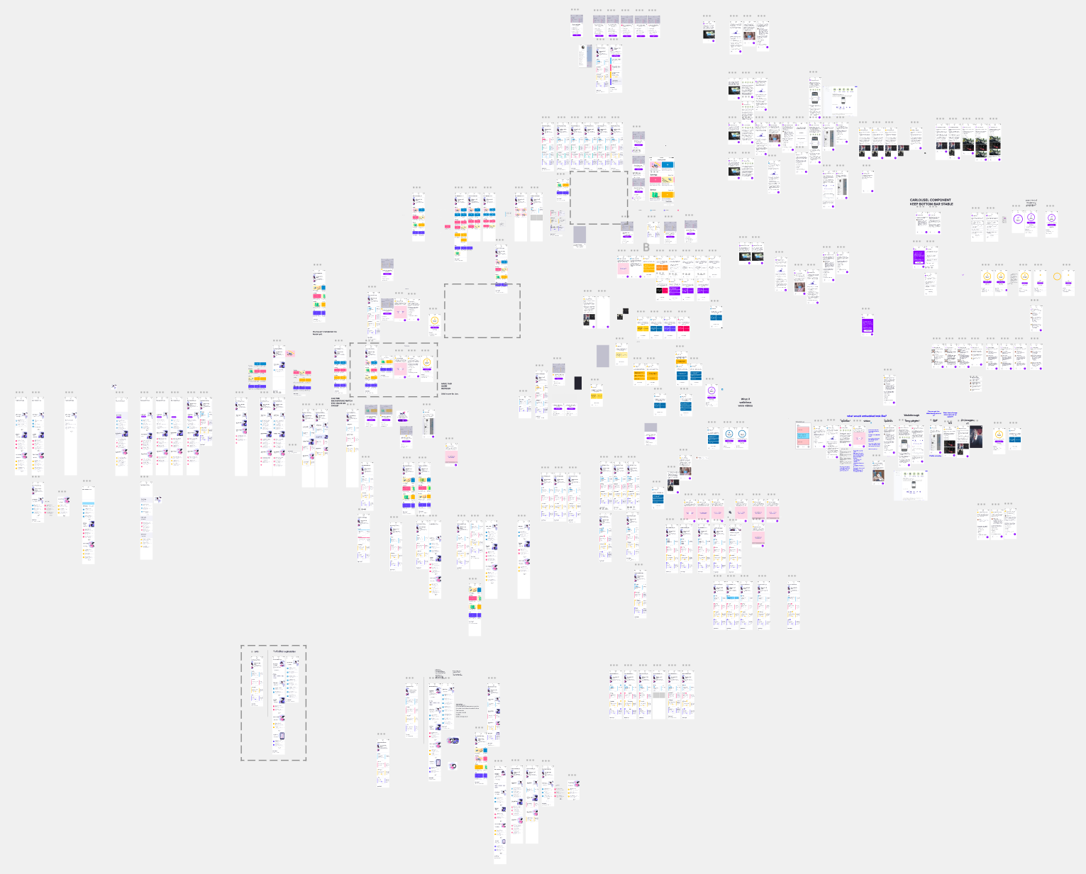
In the past, I used Zeplin to deliver redlines to product engineering. Since my current workflow is centered in Figma, I have evolved that part of my process by creating a new page within the design file labeled “🚢 For Engineering”.

There are several benefits to this approach. We, as designers, have to remember that we live in Figma; our engineering partners don’t have as much practice as we do. Creating a separate page helps define an engineering-focused workspace without a designer’s beautiful, yet chaotic cluster of design iterations and frames (or “artboards” in Sketch).
Collaboration is integrated into Figma’s DNA. Creating a separate page for engineering partners promotes asking questions and discussions between designers and engineers right on the visuals using Figma’s comment feature.
Having all parts of the design process from concept to handoff saved in the file provides a single source of truth for the project and a great resource for future iterations.
Redlines etiquette
I admit, redlines can be tedious, but I always put extra time and effort into them knowing this will help my engineering partners work more efficiently. Most of the work is focused on the structure and foundation of the design like spacing, typography, and colors. But I also like to include extras that go above and beyond to help streamline the build phase.
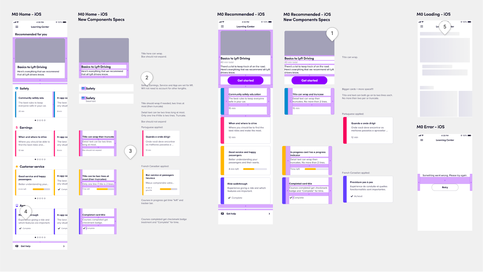
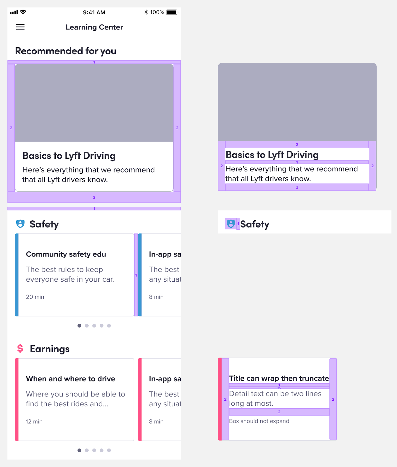
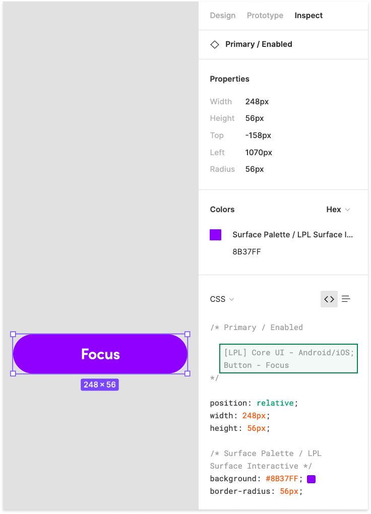
Spacing, typography, and colors are all attributes in the Lyft Product Language (LPL). We recommend that our designers use these attributes because there is a code equivalent labeled by a nickname. By using these nicknames in both design and engineering, we successfully have created a way to communicate on the same page. Engineering partners: you will be able to see the nicknames when you navigate to the Inspect panel in Figma where this information is displayed (see below image).

The inspect panel helps communicate key information such as Typography and color details by a nickname.
Typically I focus on relinking attributes within the design first when creating my redlines. I go through each text layer, and if needed, I relink them to LPL’s typography attribute. Then I move on to relinking to LPL’s color attribute.
At Lyft, I work with a talented Android engineer, Alex Lockwood, who dabbles in Figma plugin creation. He has helped make this process so much faster for myself and designers by creating a design linter that goes through and checks for unlinked typography and colors. Using his plugin allows us to quickly relink to the appropriate missing attribute.
“Lint, or a linter, is a static code analysis tool used to flag programming errors, bugs, stylistic errors, and suspicious constructs. The term originates from a Unix utility that examined C language source code.” - Wikipedia

The next piece of information that I add to the redline is spacing details. Even though engineers can click into the design to find the spacing between UI elements, it’s much easier if I just show the spacing visually. I simply place spacer components on top of the design to communicate this information.
At this point, the redline file includes enough information for engineers to successfully start building. But I take it a step further by including redlines for additional platforms. Most of the time, designs are created based on solely iOS phone sizes and Apple’s Human Interface Guidelines (HIG). To truly understand how my designs appear to all users and best support my Android engineering partners, I take on the persona of the device-agnostic designer. I delve deep into common platform conventions and patterns, leveraging guidelines such as Apple’s Human Interface Guidelines, Google’s Material Design, and Microsoft’s Fluent Design System.

Alternative information
Like I mentioned earlier, I fuss over the details and after working with a slew of product teams, I discovered that there is a piece of information missing that can further streamline the build effort. The most common question I receive from engineering partners is if a component is a custom one or not which prompted me to find a way to portray this information easily. There are two ways to do this: use of component overlays or by leveraging component descriptions.
Component overlays are a way to help distinguish if a component is part of the Design System or not. For any component that is a part of the Design System, I place a transparent overlay labeled with the component’s name on it which helps communicate to my engineering partners that this component should be easily discoverable in the code.
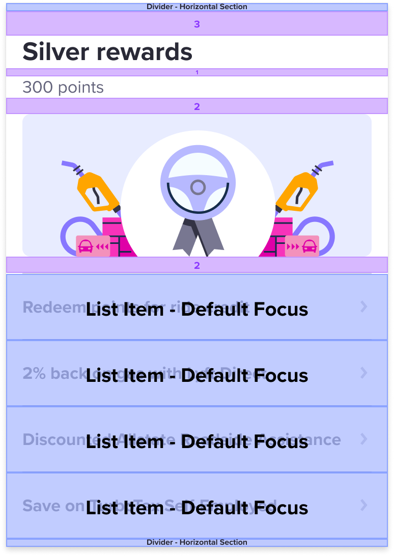
Adding component overlays is a manual process but with Figma, any published component can include information in the form of keywords and emojis. We utilize component descriptions by adding a specific phrase like “[LPL] Core UI — [Platform]; [Component name]” that shows up in the Inspect panel.
I consider a design spec to be “redline-ready” to be handed off after I have ensured all this information is captured. From my experience, these are the typical speed bumps that engineers ping designers about:
- Unlinked typography and colors
- Inconsistent spacing values
- What components are shared or custom
By doing this tedious work, I am not only providing a pixel-perfect mockup, but also a valuable resource that streamlines the handoff process.
Handoff checklist
Tl;dr to ensure quality handoff from design to engineering:
- Create a separate page and name it “🚢 For Engineering”
- Relink to design system attributes (Typography and Color)
- Place spacing details over design
- Base spacing is a factor of 8px (ie Spacer 2 is 16px: 2 x 8 = 16)
- Redline at additional platform sizes (iOS AND Android, Desktop Web AND Mobile Web)
- Audit design to replace with design system components & place overlays on top of those components (or, verify design system components have component descriptions included)
Final thoughts
Handing off from design to engineering can look vastly different from company to company. And I have seen different processes varying from team to team even within the same company as well. There is no right way or wrong way in my opinion as long as you answer the guiding question, “Am I setting up my engineering partner for success?” If you keep that in mind then handoffs will become more efficient and collaborative from project to project.